Node-RED’s dashboard nodes provide a comprehensive set of UI components for building basic dashboards suitable for the Internet of Things (IoT) – offering graphs, gauges, basic text as well as sliders and inputs. However, there will always be situations when you need something custom. The template node is the solution and in this tutorial we’ll show you a quick example of using it to create your own UI widget.
If you want a general introduction to the Node-RED dashboard or to UI techniques for Node-RED, then check out these resources which are part of our lecture series:
- Node-RED dashboard
- An alternative dashboard – FreeBoard
- Generic Node-RED UI using JavaScript charting
You can also check out a related tutorial that describes how to use an external charting library (morris.js) to create your own UI widgets with alternative graphs/charts.
The template node
The ui template node is a generic node that takes valid html and Angular/Angular-Material directives and can be used to create a dynamic user interface element.
In this example, we’ll create a simple dashboard element that displays some fake random data mimicking data from a factory machine sensor.
We want our UI element to look as shown on the right of the screen shot below (you can see how to create the 2 line chart in this tutorial)
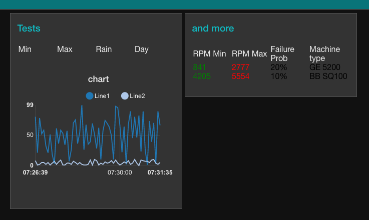
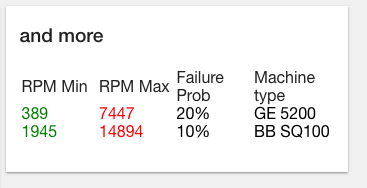
As you can see – our UI widget is named “and more” and has four data columns. These data column show the fake factory machine data and are dynamically updated as new data arrives.
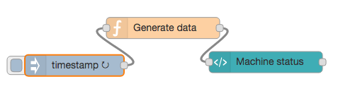
We’ll set up a flow as shown below – the function node will generate the fake data, and the UI template node, which we name Machine status, will format and present the data in the table shown above.
If we take a look inside the function node, you can see we use the usual Math.random function to generate some fake data. However, instead of just passing this data in as payload, we insert the data into a JSON structure called factory. Factory has two elements -machine00 and machine01 which in turn have four elements min, max, failProb and name.
min = Math.round(Math.random()*1000);
max = Math.round((Math.random()*10000)+1000);

msg.payload = {
  factory: {
    machine00: {
      min: min,
      max: max,
      failProb: 20,
      name: "GE 5200"
    },
    machine01: {
      min: min*5,
      max: max*2,
      failProb: 10,
      name: "BB SQ100"
    }
  }
}

return msg;
Once we have set up our function node to create the fake data. We now need to create a UI template node and set it up to display on our dashboard. As you can see below, we assign it to the Home dashboard and use a new group name “and more”. (Details on setting up dashboard groups can be found here)
Let’s take a look in more detail at the HTML used to display the data we generate in the function node.
The first <div> sets out the labels for the columns defining them using the <span flex> tag so they will fit the space nicely.
<div layout="row" layout-align="start center">
  <span flex>RPM Min</span>
  <span flex>RPM Max</span>
  <span flex>Failure Prob</span>
  <span flex>Machine type</span>
</div>
<div layout="row" layout-align="start center" ng-repeat="machine in msg.payload.factory">
  <span flex style="color: green">{{machine.min}}</span>
  <span flex style="color: red">{{machine.max}}</span>
  <span flex style="color: black">{{machine.failProb}}%</span>
  <span flex style="color: black">{{machine.name}}</span>
</div>
The second <div> then uses the ng-repeat command to iterate through the JSON structure in payload and display the data in the columns. It works by looking for each element named machine in the factory element. Remember, we named each set of data associated with a machine, machine00, machine01 – so we iterate through those.
For each machine element, we use the sub-elements; min, max, failProb and name to fill the data fields. Note how we also use a style directive to set the colour for the text. The result is shown below.
This is a simple use of the template node, but it should be enough to get you started. However, the template node is much more sophisticated, it can be used to dynamically set styles (e.g. colours), show images, create clickable elements that generate messages etc – so once you master the basics, you can go on to create some sophisticated UI widgets for your own dashboards.
To get you started with more sophisticated uses of the template node, we’ve written a related tutorial that uses an external charting library and a template node.
About Sense Tecnic: Sense Tecnic Systems Inc have been building IoT applications and services since 2010. We provide these lectures and FRED, cloud hosted Node-RED as a service to the community. We also offer a commercial version to our customers, as well as professional services. Learn more.