Showing multiple lines on a single chart in Node-RED
This simple tutorial explains how to display multiple lines on a Node-RED chart. We’ll be building on a previous example in our lecture series (Example 7.2 in lecture 7). Our aim is a simple line chart, showing two data values like this:
As discussed in that lecture, let’s start by setting up a simple flow to generate a random number and display it on a chart.
To start, let’s wire up a simple flow that sends a random number between 0 and 99 to a simple chart. For that you’ll need an inject node to repeatedly fire every few seconds, a function node to generate the random number and one of the node-red-dashboard nodes – in this case the chart node.
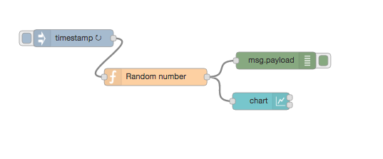
Before we look a how the chart node works, let’s configure the inject node to send a timestamp every 5 seconds by setting the payload to timestamp and the repeat field to an interval of 5 seconds. This will act as our repeating trigger. Now we need to set up the function node to generate a random number – we’ll use a simple JS math function to do this:
msg.payload = Math.round(Math.random()*100);
return msg;
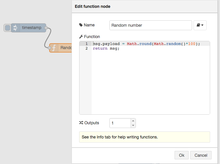
This will generate a random number between 0 ~ 99 which is passed to the chart node.
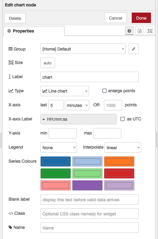
So now let’s take a look at the chart node. When you double click it, you’ll see it’s configuration options:
If you click on the button of the Group field, you will be prompted to configure the UI group.
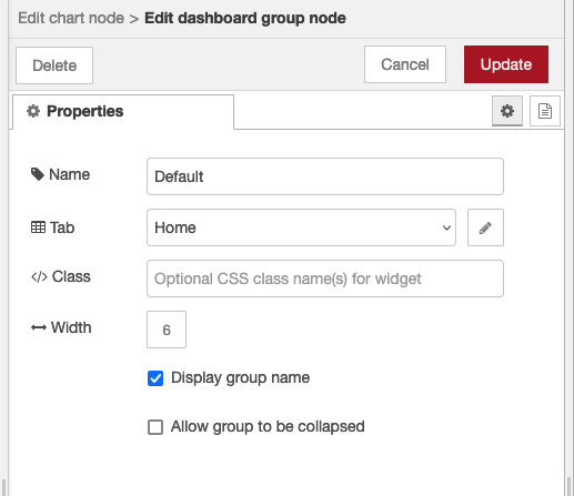
The Tab option allows you to specify which tab of the UI page you will see the UI element on – in this case our chart. The default tab is Home – which we are using here. If you select the edit button to the right of the Tab field you can create a new tab and then select that. However, we’ll use the default home for now.
Click update to save changes to the dashboard group node and let’s go back to our chart node and look at at its fields
The Label field is the chart name you want on the dashboard – by default this is chart but you can set it to anything you like.
The Group field allows you to group UI elements – we’ll show you how that works when we add another UI element so let’s use group “Default[Home]” for now – of course, you can use any string you like.
The X-axis field allows you to tell the chart how much data it should store and display – the longer the ‘last‘ filed is set to, the more data is stored and displayed by the chart. Let’s use a short 5 mins which will start to throw away the data that is 5 minutes old.
The other fields don’t need to be updated at the moment – but their names should be clear – we’ll revisit some of these later.
Wire these nodes up, hit the deploy button – check that your debug node is showing that random values are showing. Then head over to your default dashboard page to see the results. You can see your default dashboard by selecting menu->view->dashboard and then clicking on the link icon to start up a new browser tab showing your dashboard.
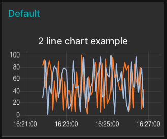
When you visit that page you’ll see your initial chart as shown below:
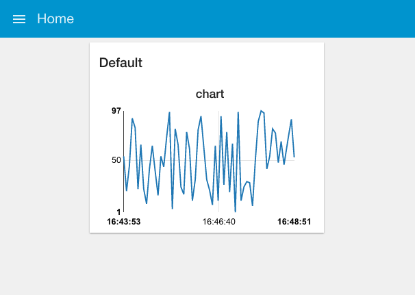
As you can see, you get a nice line chart, scaled for your data values (X axis) and the time they arrived (y axis). You can also see “Default” at the top left of the chart, indicating this is UI group “Default” – which is the group name we set in the configuration fields for the chart node.
Adding a second line to our chart
Ok, now let’s see how to add another line to the same chart.
If you take a look at the info box for the chart node, you’ll see it mentions that the the msg.topic field can be used to show multiple lines. Essentially the chart node will receive messages, take a look at the msg.topic field, and then append the data to the appropriate line as defined by the topic.
So, to extend our example to handle multiple lines on a single chart, we have to do two things:
- update our function node to generate two random numbers and assign these to different messages with different topics
- Wire up a second output from the function node to handle the second message
To do that, open up the function node and update the code inside as shown below. As you can see we explicitly create two messages, msg and msg1 (lines 1-2).
At line 4-5 we set msg.topic to ‘Line1’ and a random number is assigned to the payload. We repeat that at line 7-8 setting msg1.topic to ‘Line2’ and assigning a different random number.
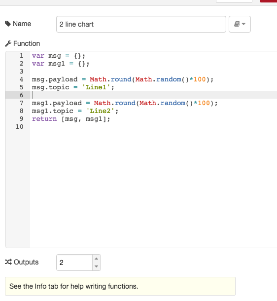
Here’s the code if you want to copy and paste it.
var msg = {};
var msg1 = {};
msg.payload = Math.round(Math.random()*100);
msg.topic = 'Line1';
msg1.payload = Math.round(Math.random()*100);
msg1.topic = 'Line2';
return [msg, msg1];
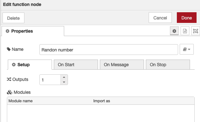
Both messages are returned using the return message (line 9) – because we are generating two return message, we need to tell the function node that it has two outputs by setting the outputs field to 2 (see below).
More details of generating multiple messages from nodes can be found in the main lectures Example 5.2 in lecture 5.
Once you’ve done this, your flow should look like the screen shot below.
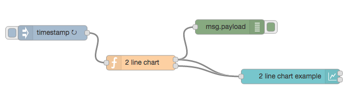
Wire up both outputs from the function node to the chart node and then take a look at the dashboard and the chart. As you can see (shown below) the chart now shows two lines (Line1 and Line2) with different colours. Note we set the dashboard theme to dark to make the two lines clearer.
If you find these lectures and tutorials helpful, why not buy us a coffee?
Obviously this example is contrived, in a more realistic example you might have two sources of data, and so two function nodes delivering messages (rather than the single function node with two outputs).
In addition, you’d be pulling the data from a real source, e.g. a web scrape, an MQTT feed or perhaps a DB. You can see examples of these:
- Scraping financial data from a web site (Example 6.1 in lecture 6)
- Getting data from an MQTT broker (Example 3.1 in lecture 3)
- Graphing data from a SQLite node (SQLite tutorial)